Tuesday, April 30, 2013

Is apple destroying what Jobs did?

Is Apple Killing the Icons That Jobs Built?

One of the guiding principles that has allowed Apple (NASDAQ: AAPL  ) to build a consumer electronics company that briefly allowed it to become the biggest company on Earth was to make things that were sleek, intuitive, and instantly recognizable as premium devices. This was a part of Steve Jobs' vision, and a central reason why the company has had so much success to date. A recent report from 9to5Mac's Mark Gurman suggests that Apple is on the verge of throwing out some of the most recognizable parts of iOS as a part of an overhaul that is known as "Innsbruck." At a time when investors and consumers are clamoring for the next big thing from Cupertino, killing the icons that Jobs built seems poorly timed.

Source: Apple

The Jobs look and feel
Pursuant to Jobs' vision, current icons and graphics have a glossy, polished look and feel that speak of the premium nature of the products they come installed on. Additionally, Apple iOS software representations of tangible objects are designed to look like what they are -- the calendar looks like a physical calendar and the notepad looks like a yellow legal pad. This was fundamental to how Jobs wanted his products to function and aided the sense that Apple made things that were easy-to-understand upgrades from classic tools.
The Innsbruck iteration of iOS, assuming that the rumors are accurate, will be a shocking departure for most current users. The glossy, 3-D representations will give way to flat ones, and the visual cues that tie physical tools to virtual ones will be abandoned as well. Gurman compared the "flatness" of the planned icons to the appearance of the Microsoft (NASDAQ: MSFT  ) Windows Phone Metro user interface. This would be the first major overhaul of this kind to iOS since the iPhone made its debut.
Chasing Microsoft?
While Microsoft builds powerful and functional products, the company's user interface missteps are legendary. The idea that Apple may be scrapping its identity for something even similar to a Microsoft UI seems like madness. So coveted is the Apple look and feel that Samsung, Google (NASDAQ: GOOG  ) , and others have long been accused of outright copying.
The impetus for the change is Apple's top designer, Jony Ive, and a growing contingent of those in Cupertino looking to move the company's image forward. Without any desire to sound like an alarmist, and allowing for the reality that we are dealing in rumor -- although Gurman has a reputation for getting good information -- this seems like a very dangerous proposition. Customers and investors have already expressed concerns that Apple isn't innovating quickly enough; changing one of the things that people like the most is a huge risk.
While there are times when refreshing what has become stale can be a good idea, suddenly fixing things that are not only not broken, but also the basis of your success, is the hallmark of mismanagement. Apple should continue to do what is does better than any other company in the world and not alter those key building blocks that got it here. Jobs' vision may not be able to last forever, but radically abandoning it is not prudent.
Apple fans have long bristled at comparisons between Jobs and current CEO Tim Cook. This may be rooted in the fact that filling Jobs' shoes is a practical impossibility, but legendary leaders frequently leave vacuums in their wakes. The potential of a cheap iPhone, a cheap iPad, and now a redesign of some of the most fundamental parts of iOS demonstrate that Apple is heading down into a new era. Investors should pay careful attention to this story, because an iPhone 5S that no longer looks like an iPhone could be a significant blow.
There's no doubt that Apple is at the center of technology's largest revolution ever and that longtime shareholders have been handsomely rewarded, with more than 1,000% gains. However, there is a debate raging as to whether Apple remains a buy. The Motley Fool's senior technology analyst and managing bureau chief, Eric Bleeker, is prepared to fill you in on reasons to buy and reasons to sell Apple and what opportunities are left for the company (and your portfolio) going forward. To get instant access to his latest thinking on Apple, simply click here now.
The Death of the PC
The days of paying for costly software upgrades are numbered. The PC will soon be obsolete. And BusinessWeek reports 70% of Americans are already using the technology that will replace it. Merrill Lynch calls it "a $160 billion opportunity." Computing giants including IBM, Yahoo!, and Amazon are racing to be the first to cash in on this PC-killing revolution.

Yet a small group of little-known companies have a huge head start. Get the full details on these companies, and the technology that is about to destroy the PC, in a free video report from The Motley Fool.

Simply enter your email address below to watch this stunning video.

Privacy / Legal Information

Green Beret still alive?

Green Beret who vanished in Vietnam War still alive?

By | The Lookout – 10 hrs ago
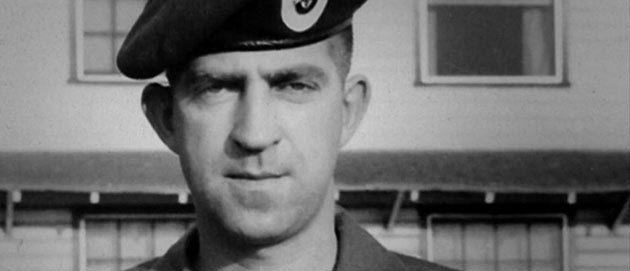
Photo of Sgt. Robertson (movieunclaimed.com)Sgt. John Harley Robertson (movieunclaimed.com)
"Unclaimed," a new documentary premiering at Toronto's Hot Docs film festival on Tuesday night, tells the story of Special Forces Green Beret Master Sgt. John Hartley Robertson, who was shot down over Laos in 1968 and was long presumed dead.
The documentary actually follows fellow Vietnam vet Tom Faunce, who heard about Robertson's whereabouts while on a humanitarian mission and wants to find him. Faunce does track down someone claiming to be Robertson in a remote village in south-central Vietnam. The man, according to the Toronto Star, was a "wiry 76-year-old" who "trembles with frustration or pounds his forehead when he is unable to remember his birthday or his American children’s names. He is only able to speak Vietnamese."
According to the documentary, directed by Edmonton filmmaker Michael Jorgensen, Robertson was captured by North Vietnam forces and tortured, but eventually escaped. Rather than return to his wife and children in the U.S., he stayed in Vietnam and married another woman, assuming the name of her deceased husband, Dang Tan Ngoc. An article from the Toronto Star says that in the years since, he has apparently forgotten how to speak English.
The Globe and Mail writes that the man was "prone to weeping and fits of dementia. His memory was in tatters, unable to conjure even a seemingly simple fact like his birthday or the names of his two American children. And when he did remember, the recollections often were wrong or difficult to confirm. The U.S. military, moreover, refused any help or information."
Whether or not the man is indeed Robertson remains unproved. But, as the Toronto Star puts it, the film "makes a compelling case":
There is physical proof of Robertson’s birthplace, collected in dramatic fashion onscreen; a tearful meeting in Vietnam with a soldier who was trained by Robertson in 1960 and said he knew him on sight; and a heart-wrenching reunion with his only surviving sister—80-year-old Jean Robertson-Holly—in Edmonton in December 2012 that left the audience at the Toronto screening wiping away tears.
Robertson-Holly was offered a chance to take a DNA test to prove the relationship, but declined, saying she didn't need to to know the man is her brother, according to the Toronto Star. Jorgensen told the paper that Robertson’s American wife and two children initially offered to participate in DNA testing, but later withdrew the offer.
While speaking to the Globe and Mail about his film and what's next for the man believed to be Robertson, Jorgensen said, "There’s maybe a bit of a misconception; everybody assumes: ‘Well, obviously, he wants to come back to North America. But at this point he’s happier being back there, taking care of his wife, to whom he feels an incredible amount of loyalty, and their kids."
Below, the trailer for "Unclaimed."
Loading...

Thursday, April 25, 2013

47 of the most current jobs in Nigeria today

To:
semanticdmax@yahoo.co.uk

Tuesday, April 23, 2013

Tsarnaev's condition improves

Tsarnaev’s condition improves; brothers reportedly motivated by U.S. wars

By | The Lookout – 10 hrs ago
Dzhokhar Tsarnaev (AP/File)
Boston Marathon bombing suspect Dzhokhar Tsarnaev informed investigators that he and his brother were not directed by a foreign terrorist organization. Instead, they were “self-radicalized” and motivated to kill, in part, by U.S. wars in Iraq and Afghanistan, the Washington Post reported.
The 19-year-old also acknowledged his role in the attack while being questioned by investigators in his hospital bed, the report said. Tsarnaev, who has a gunshot wound to the throat and was sedated, responded in writing. He also suffered gunshot wounds in the head, neck, legs and hand during a late-night shootout in Watertown, Mass.
Meanwhile, Tsarnaev's condition is improving, the FBI said on Tuesday. The college student, who had been listed in serious condition at Beth Israel Deaconess Medical Center since his capture on Friday, is now in fair condition, the bureau said.
The update comes a day after Tsarnaev was charged with two federal counts of using a weapon of mass destruction to kill, injure and cause widespread damage at the marathon. Tsarnaev was informed of the charges and read his rights in his hospital room on Monday morning, and placed in the custody the U.S. Marshal Service. If convicted, he could face the death penalty.
[Related: ‘#FreeJahar’: Support for Dzhokhar Tsarnaev seen on Twitter]
Three people were killed and more than 200 others wounded when two powerful homemade bombs exploded near the race’s finish line. Dzhokhar and his 26-year-old brother, Tamerlan Tsarnaev, who was killed by police as the two attempted to avoid capture, are suspected of planting those bombs.
Tamerlan was an ardent reader of jihadist websites and extremist propaganda, U.S. officials told the Associated Press, suggesting the brothers were motivated by an anti-American, radical version of Islam.
Meanwhile, U.S. investigators traveled to southern Russia on Tuesday to speak to the parents of the brothers, a U.S. Embassy official told the news service. Zubeidat Tsarnaeva, the mother of the suspects, and their father, Anzor, are in Dagestan, a predominantly Muslim province in Russia's Caucasus.
After the bombings, Anzor said he believed the brothers were set up and called Dzhokhar a "true angel." Maret Tsarnaeva, the brothers' aunt, who lives in Toronto, also said she believes her nephews were framed.
Family members are not the only ones expressing doubt.
Many Twitter users have been expressing support for Dzhokhar using the hashtag #freejahar.
And just like the conspiracy theorists who claimed last week that the Boston Marathon attacks were staged, the support for Dzhokhar has been fervent despite his reported confession.
A Change.org petition to "guarantee Dzhokhar Tsarnaev the right to a fair trial," addressed to President Barack Obama, has more than 6,000 supporters.
"We believe that within the chaos caused by the Boston Marathon explosion, two young men were wrongfully accused of something they did not do, and one of them has lost his life before even getting the opportunity of a proper trial," Anita Temisheva, the user who launched the petition, wrote. "We do not wish to see blood of yet another innocent victim, someone who, by U.S. law, is innocent until proven guilty. It is vital to end this persecution, as all the conflicting information shown by the media, and footage from the incident, seen by people from all corners of the world, doesn't manifest itself as enough evidence to condemn Dzhokhar Tsarnaev of this heinous crime."

Koreans bash Gates for improper handshake

Koreans Slap Bill Gates for 'Rude' Handshake

By | ABC News Blogs – 7 hours ago
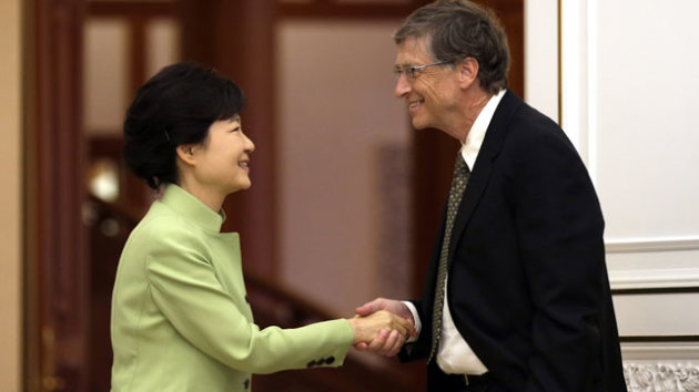
SEOUL, South Korea - The buzz in town today is this photograph of Microsoft founder Bill Gates' shaking hands with South Korea President Park Geun-hye.
Gates, 57, might have not realized it Monday, but a one-hand shake in Korean culture - and also in Asia - is notably casual, done only when the other party is a good friend, of the same or younger age. Using one hand with the other tucked in the pants pocket is considered rude here, done when one is expressing superiority to the other.
"Perhaps it was his all-American style but an open jacket with hand in pocket? That was way too casual. It was very regretful," said Chung Jin-suk, secretary general at the Korean National Assembly.
President Park's office has said nothing publicly about the incident and a spokesperson for Gates declined to comment.
But Internet chat rooms and social network sites are filled with views debating cultural differences and analyses of Gates' laid-back style.
"I don't know if that was ignorance or just plain disrespect," Cho Park, a Korean student studying in New York, said. "It was pretty rude of him. The thing is I'm not sure if it is rude in Western culture."
The controversy doesn't end there. Gates had met with two other previous South Korean presidents: Kim Dae-jung and Lee Myung-Bak. He apparently gave the proper handshake with both hands to the late Kim in 2002 but was spotted giving an improper shake to President Lee in 2008. That also became a subject of debate.
Some South Korean media have been speculating that perhaps it was intentional, showing his political preference; respect for the opposition leader Kim but disrespect for the ruling party leaders Lee and Park, 61.
"Cultural difference or bad manners?" the Joongang Ilbo newspaper wrote.
"A disrespectful handshake or a casual friendly handshake?" DongAh Ilbo newspaper said in its photo caption.
"It's a head of state we're talking about," said Rick Yoon, a brand retailer in Seoul. "And she's a lady. This is not just a Korean thing. It's an international protocol.
"Maybe it was intentional. Otherwise, he has a very strange habit."
Gates was in South Korea on a three-day visit to promote his start-up TerraPower, which is developing next-generation nuclear reactors.
ABC News' Joanne Kim contributed to this report.
Also Read

Five frustrating car infotainment systems

5 frustrating car infotainment interfaces

Driving sure isn't what it used to be. And while that might apply just as well to how that new car accelerates, steers, or rides, here we're talking about what's inside—namely, that big, bright screen in the middle of the dash.

So-called infotainment interfaces are becoming a center point to the in-car experience—an essential part, if you ask some vehicle shoppers. And yet, these systems, which bring features like navigation, hands-free calling connectivity, music and media management, and all sorts of additional information and productivity into the car—and wrap it all together with a single go-to interface—are quite often maligned.

At best, they're the smooth, cohesive way to do everything you might want or need to do from behind the wheel, while keeping your eyes on the road and keeping you from picking up a hand-held device. But at worst, these systems can be distractions in and of themselves.

What makes some of these systems feel natural and others frustrating? Whether considering MyFord Touch (Ford), CUE (Cadillac/GM), iDrive (BMW), COMAND (Mercedes-Benz), MMI (Audi), Uconnect Touch (Chrysler), the elements that make up these interfaces aren't not all that different, fundamentally. Even though their hardware might be significantly different, you have a display screen (touch-sensitive, or capacitive in some cases); there's a rotary or toggle controller on most; voice control is deployed to some degree; and then you have some back-up buttons on the dash and/or steering wheel, with a corresponding graphic array and menu system.

Comparable hardware, very different implementation

“It's the nuance of it that makes them so distinct,” says Mark Boyadjis, a senior analyst at IHS Global insight.

And more than the actual capability of the system—the resolution of the display, or the amount of storage, for instance—it's in the fine user-interface details where some of these systems can delight, or frustrate, Boyadjis notes.

Ford may have jumped the gun in getting its MyFord Touch (voice- and touch-screen-based system) launched several years ago; at first it pushed ahead without regard to some of the fine details—resulting in issues like screen freezes, fonts that changed appearance, and menu options that intermittently disappeared. Although the automaker has fixed many of these hiccups and it's now quite good, notes Boyadjis.

To some degree, it's also the cost of being a forerunner. BMW quite famously first launched its iDrive more than a decade ago with a haptic-feedback rotary controller essentially replacing a sea of buttons. The design result was breathtaking and elegant, but buyers ended up bewildered by the interface, which concealed some relatively common tasks in nested menus, within other menus. Over the years, BMW has brought out several better versions, added better voice control, and brought back some of those buttons; although it's still on our list of frustrating interfaces.

A lot of disappointment out there...

Yet disappointment and dissatisfaction with the hands-free features, as related to these systems, is widespread, and satisfaction with original-equipment navigation systems and interfaces is falling. The market research firm J.D. Power attributed infotainment issues to a tumble in its 2012 Initial Quality Study (IQS), which looks at issues in the first 90 days of vehicle ownership. Hands-free systems not recognizing voice commands was the single most-reported problem, while owner-reported problems with factory hands-free systems has climbed 137 percent in four years.

At the same time, as certain tasks and apps—everything from customized music streams to text-to-voice features to turn-by-turn navigation—are becoming smartphone based, the role of such systems is rapidly changing, going well beyond a hands-free phone interface and a menu system for navigation. For instance, in J.D. Power and Associates' 2012 U.S. Navigation Usage and Research Study, 47 percent of vehicle owners polled indicated that they used a smartphone app for navigation in the vehicle, while 46 percent said that they either “definitely would not” or “probably would not” purchase another factory-installed nav system, if smartphone navigation were integrated.

"Navigation systems are no longer viewed as a stand-alone component, but as part of a media, safety and infotainment package, and are expected to seamlessly work together, but in many cases are falling short of owner expectations," summed J.D. Power analyst Mike VanNieuwkuyk at that time.

After much debate, the High Gear Media editorial team singled out a few interfaces that either perform sluggishly or are stubbornly particular about the way people must interface with them. Although some of the newer screen-based systems like GM's CUE aren't short of issues either, we agree with the analysts we've spoken to and agree that more interface options is a good way to avoid frustration.

All-in-one vehicle interfaces are here to stay, and they're getting better; but follow on to see five systems that could drive you bonkers. And be sure to tell us about your own experiences: What works and what doesn't?


2013 BMW 3-Series fitted with M Performance accessories2013 BMW 3-Series fitted with M Performance accessories

BMW iDrive

BMW could have changed course after its once much-maligned iDrive was introduced more than a decade ago on the 7-Series. But BMW stuck with it, and several iterations later it's much-improved.

That said, iDrive still requires a steep learning curve, and for those who are first getting into a car with without having first watched a video on it, gotten a presentation, or perused an owner's manual, it's hardly straightforward. At the same time, others of us appreciate how the core interface of iDrive—involving first pushing the knob in a particular direction, then twisting it (with haptic feedback) to navigate the menus, hasn't changed in many years. If you've learned it once, it's familiar across their models.

Even on recent versions of iDrive, voice commands are limited while there's still no physical way to shortcut the knob interface and hard keys.

Curiously—and against the very reason for its existence in the first place—BMW, in order to make iDrive more functional, has actually brought some buttons back.


Mercedes-Benz C250 CoupeMercedes-Benz C250 Coupe

Mercedes-Benz COMAND

Mercedes-Benz starts with a simple rotary or toggle controls for its so-called COMAND in-dash system. But almost anyone who's used a smartphone or tablet will find that the menu system here is a confusing mess at times. Main menus appear up high, with submenus down low (sometimes additional options appear to the left or right); the screen doesn't allow touch; and using voice controls to their best requires you to pre-record yourself saying a long set of commands. Some things like navigation place-name entry and phone pairing are more complicated than they need to be, too.

“COMAND is the worst interface of the modern crew, but one of the easiest to actually use,” summed one of our editors, who noted that despite its odd, unintuitive organization, nothing is more than a couple of levels deep in the menu structure.


Lexus ES350Lexus ES350

Lexus Remote Touch

We're conflicted about this one, honestly. Perhaps in a nod to the older crowd that tends to consider the brand, Lexus has set up its Remote Touch system to be about as close to a simplified desktop computer as you'll find in a car. The screen uses a simple, understandable menu system, nice large fonts and boxes, and takes advantage of color. And several of our editorial team do appreciate how the system has haptic feedback, allowing you to feel a little pull (or click) as you go from one screen option or area to another. Yet several of us see this system as one of the most frustrating of all, because even after you 'learn' the system you still need to keep an eye on the screen—and off the road—whenever making a selection.


Audi A8 audio systemAudi A8 audio system

Audi MMI

An editor called the latest iteration of Audi's Multi-Media Controller (MMI), now used throughout much of the lineup, “half-brilliant, half-assed,” and much of our staff agrees. While we love the beautiful, very functional Google Earth maps and wide-screen displays, and the very cool scratch pad that lets you trace out letters for destination input, we find the structure of its menus—and how there aren't just easy, ever-present shortcuts, presets, or bookmarks for frequent tasks—frustrating once you get to use the system more.

“The Germans, as a group, have decided we're too dumb for touchscreens,” commented another editor. “There's physically no way to shortcut the knob interface and hard keys.”


2014 Mazda6 interface2014 Mazda6 interface

Mazda TomTom Navigation

In an affordable car, the new Mazda system was the most frustrating system of any we've recently encountered. The top-level infotainment system in the new 2014 Mazda6 and CX-5 pairs TomTom navigation with integration for hands-free calling, media and satellite radio, and even Pandora music integration, provided you've installed the app on an iPhone or other approved handset. But maps and menus are laggy, voice controls are extremely limited, and the central-console controller, while it looks great, ends up feeling like an underdelivering iDrive knockoff.
AdChoices
<SCRIPT language='JavaScript1.1' SRC="http://ad-ace.doubleclick.net/adj/N6092.yahoo.com/B7261232.25;abr=!ie;sz=300x250;dcopt=rcl;mtfIFPath=nofile;click=http://clicks.beap.bc.yahoo.com/yc/YnY9MS4wLjAmYnM9KDE2MDlkdmU0ZShnaWQkYXJNT0tRckhnMi5mdFkycFVXR0g1d0JweEM3Mk9WRjNjU3NBRFV5ZSxzdCQxMzY2NzgyMjUxOTgyOTk2LHNpJDQ0MDcwNTEsc3AkMjE0NTE1NzA1MSxjciQzMzMyMjM5NTUxLHYkMi4wLGFpZCR6Qmw5YW1LTEYuQS0sY3QkMjUseWJ4JDF4bm9vOHFYb1puak1BdGJHUGlxbEEsYmkkMTYxMDAyNjU1MSxyJDEscmQkMTZpcWJvcXFnKSk/1/*http://global.ard.yahoo.com/SIG=15lpjnp0t/M=999999.999999.999999.999999/D=media/S=2145157051:LREC/_ylt=AkWAjNoJz0kyTQrbQ2KfBpK7f9x_/Y=YAHOO/EXP=1366789452/L=arMOKQrHg2.ftY2pUWGH5wBpxC72OVF3cSsADUye/B=zBl9amKLF.A-/J=1366782252035554/K=TimLm2ijwJ79440Koh6zEQ/A=6754308738810348092/R=1/X=6/*;ord=1366782252.35554?"></SCRIPT>

Follow Yahoo! Autos

RESEARCH A CAR

Top Rated

Category: Sedans

More Articles

  • By Jim Forsyth SAN ANTONIO (Reuters) - Using voice to send text messages while driving is just as dangerous as texting with fingers, with driver response times significantly delayed no matter which method ...
  • Putting a celebrity in your ad will make your car sell better, right? Jalopnik readers know ten ads that question that maxim.
  • Infotainment interfaces are becoming a center point to the in-car experience—an essential part, if you ask some vehicle shoppers. And yet, these systems, which bring features like navigation, hands-free calling connectivity, music and media management, and all sorts of additional information and productivity into the car—and …
  • Fisker Automotive Inc. spent more than six times as much U.S. taxpayer and investor money to produce each luxury plug-in car it sold than the company received from customers, according to a research report.
  • Join Yahoo News editors and reporters at 7:45 a.m. ET Friday to discuss the latest developments in the Boston Marathon bombing investigation. A late-night police chase and shootout ended with one bombing suspect dead and, as of early Friday morning, another was on the run, Boston Police commissioner Ed Davis said.