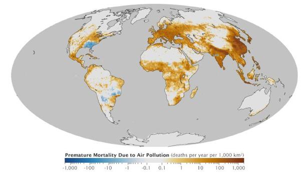
This new map, released by NASA,
plots the effects of fine particulate matter throughout the world,
revealing what regions have the highest numbers of premature deaths due
to air pollution.
Smoggy days can make life miserable for us, stealing
our breath away and making us wish for simpler times. Monitoring
programs and public alert systems try to keep us informed about the
quality of the air we breath, but studies have shown that breathing in
even small amounts of air pollution over long periods of time can
shorten our lifespan.
Of all the pollutants in our air, the one that causes us the most difficulty is fine particulate matter
— tiny specks of dust, smoke and ash, or minuscule droplets of various
chemicals, that are so small that they can get deep into our lungs,
damaging sensitive tissues there. An international research team, led by
Jason West
of the University of North Carolina, studied the worldwide effects of
fine particulate matter between 1850 and 2000, and it's the data from their study that went into piecing this map together.Areas shaded in brown are the worst regions in the world for premature deaths due to air pollution. Blue regions, like the U.S. Southeast, are those where fine particulate levels have actually dropped (apparently due to a reduction in the amount of local burning) over the past 160 years.
[ More Geekquinox: McGill students win $1M prize with idea to feed bugs to the world ]
According to the study, an estimated 2.1 million premature deaths happen every year in the world due to fine particulate matter, with 93 per cent of those caused by the effects of the particulates on our heart and lungs, and the other 7 per cent due to lung cancer. Ground-level ozone, the other main component of smog, has also taken its toll, resulting in an estimated 470,000 premature deaths per year around the globe.
Given that the main source of these two pollutants is fossil fuel burning, even if you don't believe the overwhelming evidence that the use of these fuels is putting us on a road to climate disaster, just the resulting increase in our lifespans is probably a good enough reason to switch to other sources of energy.
(Map courtesy: NASA Earth Observatory)
Geek out with the latest in science and weather.
Follow @ygeekquinox on Twitter!
For more of my writing and books go here
https://www.smashwords.com/profile/view/semanticdmax
http://www.lulu.com/spotlight/semanticdmax
http://www.amazon.com/s?ie=UTF8&field-author=Ifedayo%20Adigwe%20Akintomide&page=1&rh=n%3A283155%2Cp_27%3AIfedayo%20Adigwe%20Akintomide

No comments:
Post a Comment